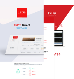
We understand that different clients have different needs. Therefore, we offer a wide selection of trusted, award-winning platforms and account types to choose from.
Copyright © 2026 FxPro. All rights reserved.
REGULATORY INFORMATION
FxPro provides online trading services through entities authorised and regulated by leading financial authorities in their respective jurisdictions. The products and services available to you depend on your country of residence and the FxPro entity with which your account is maintained.
JURISDICTION RESTRICTIONS
FxPro does not offer Contracts for Difference to residents of certain jurisdictions, including the United States, Iran and Canada. Additional restrictions may apply depending on local regulations.
LEGAL INFORMATION
By using this website, you agree to our Terms and Conditions, Privacy Policy, Cookie Policy and other applicable Legal Documents.
Trading Risk Warning
CFDs are complex instruments and come with a high risk of losing money rapidly due to leverage. Please ensure you fully understand how CFDs work and whether you can afford to take the high risk of losing your money.
The information on this website is provided for general information purposes only and should not be considered investment advice or a recommendation to trade.
CONTACT & SUPPORT
Need assistance? Our multilingual support team is available 24 hours a day, 5 days a week.
TELEPHONE
+44 (0) 203 151 5550
FXPRO HQ
FxPro UK Ltd: 80 Coleman Street, EC2R 5BJ London, UK